
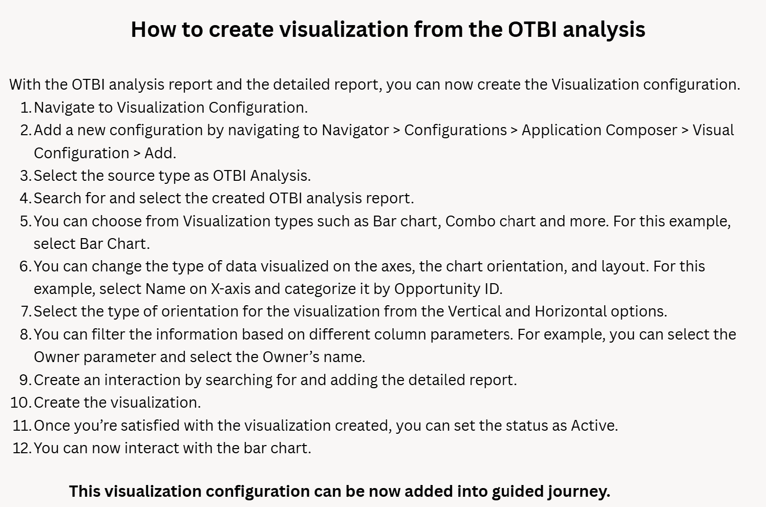
As you know, OTBI reports have been part of Guided Journeys for a while.
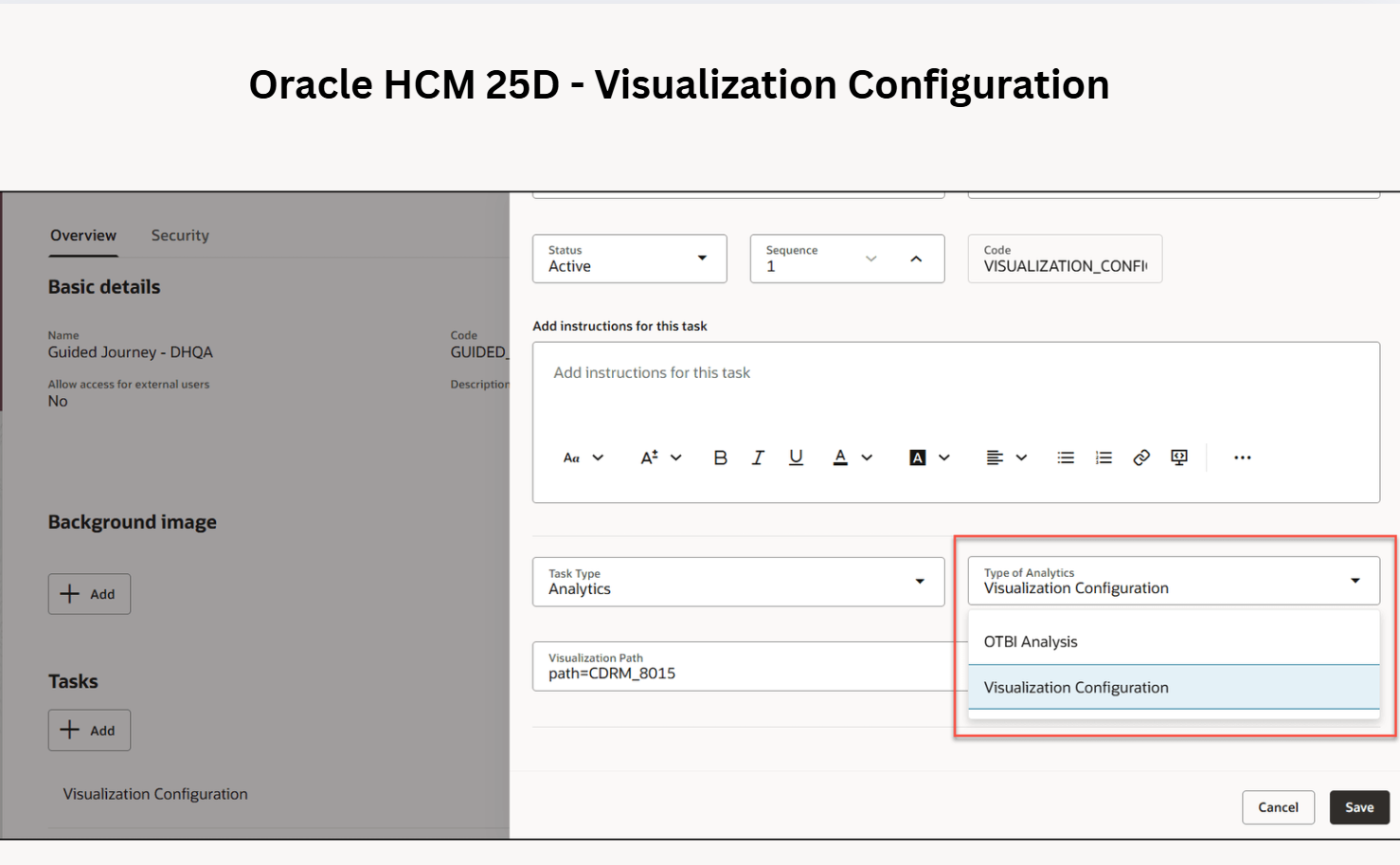
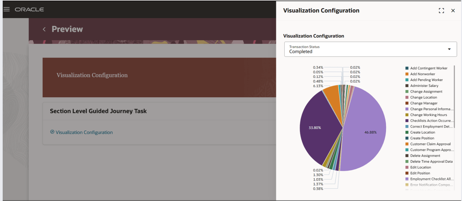
With 25D, Oracle has introduced Visualization Configuration within guided journey. Embedded visual analytics make Oracle HCM Cloud 25D even more intuitive and insightful.
– Use the Visualization tool to present your OTBI data in charts, tables, or other visual formats.
– Activate the visualization once it’s ready.
– Include the active visualization directly within a journey task using the Redwood theme.
Watch this video to learn how to create a visual presentation of your data: https://lnkd.in/ektaKNmJ
This enhancement allows users to review, analyse, and act on insights instantly without leaving the Guided Journey.


Leave a comment